BIOFUELS
When I first started working with the Biofuels project team, they were going through a rebrand. This is the concept I pitched for the new brand.
After many brainstorming sessions and entire packs of post-its, I decided to start with the competition. In the case of a project team, where you are competing for good recruits and corporate sponsors, the competition is other student groups and project teams. I thought a lot about the other project teams with a sustainability focus, and how we were different. That's when I arrived at the core tenant of the brand: most of the other project teams were made up of mainly designers, we were a group of hardware engineers.
I decided to embrace the hardware engineering idea, the idea that it's a group of kids who like to get their hands dirty in lab. The personality I finally settled on was as follows:
CORE VALUES
1. Environmental Sustainability
2. Research
3. Exploration
PERSONALITY
1. Messy
2. Edgy
3. Innovative
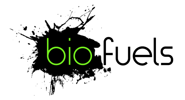
I went through a few iterations of logo design, and I wasn't liking anything. It was still too similar to other groups on campus. It finally occurred to me that I was using too much green. I didn't think the group was well known enough to get away with dropping the color green altogether--we still needed people to recognize us as a sustainability team.
What I ultimately decided was to go dark. I wanted mostly black with green accents. I also wanted to have a really electric green. It's the kind of green that would be totally deplorable to the current crop of designers on campus. My hope is that, in a subtle way, it comes across as the kind of green an engineer would pick and not care what his graphic designer friends thought about it. The Comic Sans of colors.
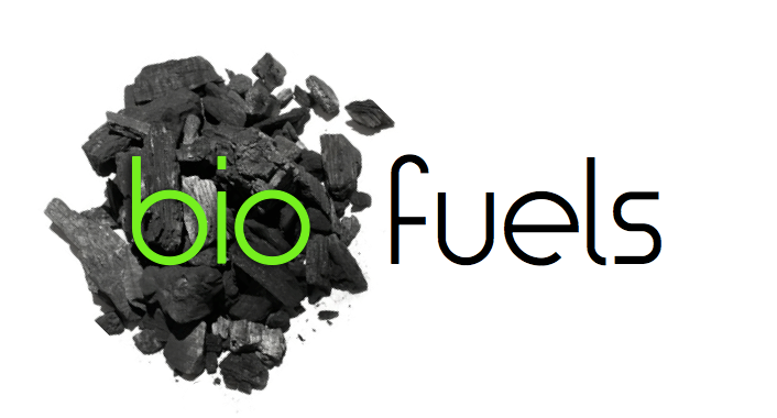
For the brand imagery, I decided to embrace what our mess really was: oil and charcoal. Although in their biofuel forms they are not always black, I wanted it to be really recognizable so I stuck with blacks and grays.
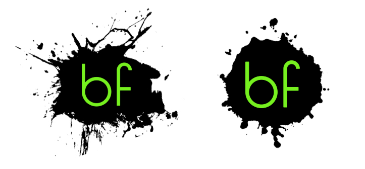
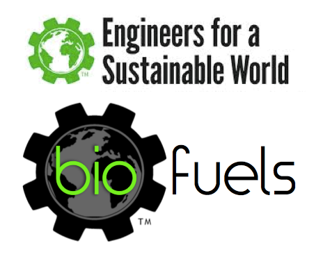
The end product is a logo that can be used in its long form or shrunk down for square social media photos and laptop stickers (two big advertising mechanisms on college campuses). It can also be adapted based on the project at the time, or to match the brand of the umbrella organization: Cornell Engineers for a Sustainable World.